The iOS 16 Books App
Note: This page clocks in at nearly 100MB, which is enormous. The size is mostly due to uncompressed screen recordings that download when the page loads rather than e.g. when the reader clicks play, and partially because of uncompressed screenshots that have not been resized for web. I plan to fix all of these things, but I haven’t had the time yet, and I didn’t want to wait to publish the post until I did. Don’t let the perfect be the enemy of the good, or something.
Apple’s Books app has featured roughly the same reading experience since it was released in 2010. The experience changed this September with the release of iOS 16. The interface was fully redesigned, and I suspect it was also rebuilt using Swift UI.
While the team surely had good intentions, the new interface is, in my opinion, bizarre. It is also ridden with so many bugs that books are frequently unreadable. I was so surprised by the collective changes that I have cataloged them here.
Design
Since iOS 7, Apple has designed apps to highlight content and de-emphasize UI controls. This is usually accomplished by hiding or shrinking UI elements until the user taps somewhere to reveal them. This was the case in the old Books app: only the content of the book was visible until you tapped the middle of the page, making several buttons appear.
In iOS 15 and before, when you open a book, the book is all you see:

Tapping the screen anywhere revealed all available controls:

Not so in iOS 16. Now when you open a book, a close button and a mystery button are always visible, hovering over the text:

The mystery button is adorned with an icon I’ve never seen on iOS, so I don’t know what it does. It looks a bit like an upside-down DC flag.

If you’ve clicked a link to jump elsewhere in the book, another button with an arrow and a page number appears. Tapping it jumps back to your previous position in the book. Tapping anywhere else on the page reveals more UI elements with information like the current page number, but they are not interactive.

Animation typically has a purpose on iOS, but the new Books app isn’t typical. The floating controls will animate around when you tap, even if they’re not in the way of anything. It’s a totally useless animation.

In iOS 15 and before, the interface had buttons for viewing the table of contents, setting the theme, and searching the book. Where have they gone?
To reveal the rest of the controls, tap the DC flag button. You’ll find that difficult because the button is very small. On my iPhone 13 Pro, it is only 84 pixels to a side. At the 3x scale of a Super Retina display, that is 28 points, which is substantially smaller than Apple’s own recommendation of 44 points for touch targets. The contrast between their content (text and icons) and background is also very poor.
In attempting to touch this button, or even simply scroll through your book, you will likely make this symbol appear on accident:
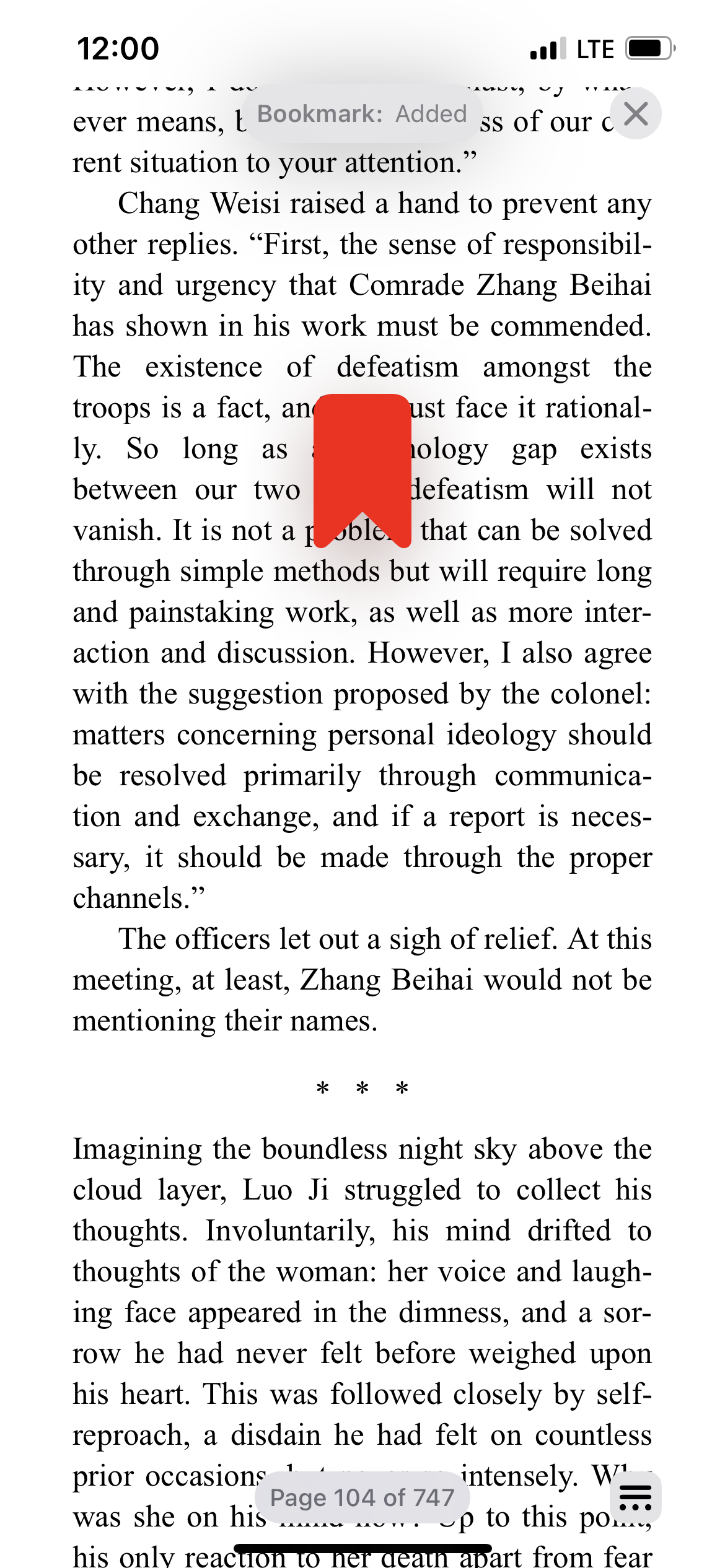
The new interface is extremely sensitive to double-tapping, which now bookmarks the current page. My books are littered with bookmarks I’ve added on accident while scrolling.
When you marshal your fine motor skills and tap the tiny button, some labeled controls are revealed:

The button labels are the sole part of the redesign I consider an improvement. I know many people, especially older folks, who are afraid of pressing random buttons on the computer. We in the tech industry take for granted that everyone knows what a search or bookmark icon looks like, but not everyone is so clued in to the conventions of modern software, and everyone must learn everything for the time at one point or another. For this reason, labeling buttons is a good accessibility practice.
Unfortunately, the new control panel contains further oddities. Tapping the page used to reveal a scroll bar. Now you must open this overlay to scroll, and you’ll do it with a non-standard control (seen on the right-hand side). This control debuted in Control Center, where it is used to raise and lower the screen brightness and volume. In both cases, it “fills up” to represent adjusting the magnitude of something. That metaphor makes no sense for scrolling through a book. Moreover, the control is a poor choice because books are long! When the scroll bar was the height of the screen, you could scroll in more precise increments. Now a smaller area area represents the same span. This control is not used this way anywhere else in iOS.
On the topic of non-standard controls, the panel also shows an app-specific orientation lock, something no other first-party iOS app offers. To maximize confusion, it uses the same icon as the system orientation lock in Control Center, but appears to be unrelated; neither affects the other. Adding insult to injury, the icon is visually inconsistent; its stroke width is clearly a few pixels wider than the icons next to it.
Tapping Themes & Settings shows options for customizing the appearance of the book. The old Books app already supported four colors, light & dark modes, and changing the typeface, and the new interface allows for even more.

The layout on this page is even more confusing. The good practice of labeling mystery icons is forgotten; I recognize the light/dark mode toggle, but what is the icon beside it? Toggling it does not immediately reveal its purpose; it just causes the page to re-render. You have to tap it, close the panel, and swipe around to discover that it’s a toggle for infinite scroll vs paginated reading.
The dark mode button isn’t as simple as it seems either. The six boxes at the bottom appear to show five light themes and one dark theme, but tapping the button reveals that the app itself has light and dark modes:

I could understand six themes, each with a light and a dark mode, but why confuse things by including one theme that’s always dark?
Moving on, above the scroll mode and dark mode buttons is a line of text: Original Options > looks like a button, but what is Original? You have to look below: We’re using a theme called Original, and for some reason the theme name is run together with a textual button on this line. Never mind that labels should be near related controls; why is Original here at all when the selected theme is already clearly marked with a bold outline below?
It gets worse if you actually click on Options >:

The header is “Original Options”! If you missed that you’re editing a theme called Original, you might think you’re editing a set of default options. “Original” is a bad name for a theme, and this is bad typography.
That’s not the only poor choice on this page. The page is dedicated to customizing the theme, so it shows you buttons for changing the font, making the text bold, and… customizing the theme even more, I guess. Why are there customization options behind a toggle on a page already dedicated to customization? And to highlight the first of many bugs, why does simply activating this toggle change the layout preview above?

Unluckily for the reader, these poor UX choices will be the least of their problems when trying to read their iBooks. That brings us to the bugs.
Bugs
I tried my best to document the bugs I encountered with a screenshot or video.
With Evidence
Scrolling at the end of a chapter can jump over text:

Highlighting sometimes does not work:

Sometimes the app renders nothing at all:
Landscape mode sometimes does not reflow text from portrait:
Scrolling is jumpy: (best viewed at 60+ hertz)

The app may not respect system-wide dark mode, even when configured to do so:

Sometimes the scroll bar does not render to the side, but is instead merged with the Contents button:

Tapping multiple links can spawn jump-forward and jump-back buttons that never go away, and crowd out other controls:

Without Evidence
- Changing the theme can lose your place in the book, jumping you to the start of the chapter.
- Books normally syncs your position in a book between Apple devices. The update has broken this; opening a book on another device jumps you anywhere from pages to chapters away from where you were.
- Changing fonts sometimes does not work.
- An earlier version of the Books app added a “Reading goal achieved” notification that appeared if you spent five minutes reading on a given day. This used to be a standard push notification, so if your system-wide Do Not Disturb was configured to hide notifications while the phone is unlocked, the reading goal notification would respect that. In iOS 16, the notification is now an in-app notification that uses a nonstandard control, and it does not respect DnD. If you are like me and use Do Not Disturb with the intention of not being disturbed, you will be disappointed. The app is so happy that you achieved your reading goal that it will interrupt your reading to tell you about it.
Visual Bugs
These are more a matter of taste, but I consider them to be bugs.
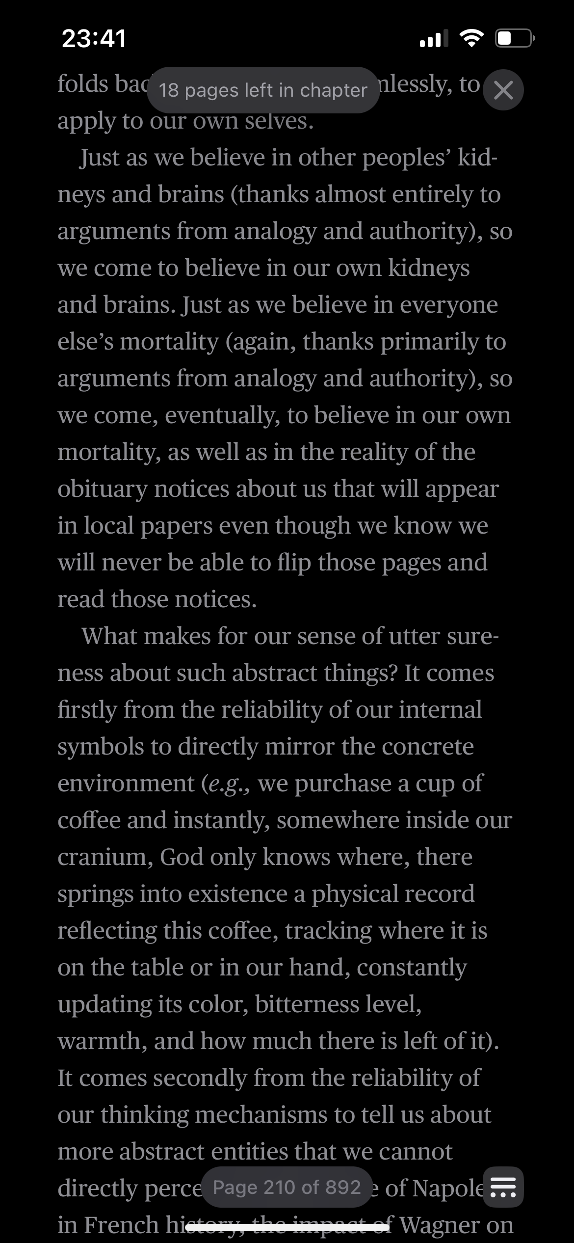
The “pages left in chapter” floating label is not always centered:

The Books app used to justify text by default. This is consistent with every single printed book on my bookshelf. The update has an option for justifying text, but no longer does so by default:
I find this especially egregious because I never noticed that the old app justified text. That was intentional: The designers replicated the experience of written books so well that I didn’t even notice. Only in the new update, in which designers couldn’t be bothered to care about such things, did I notice.
Closing Thoughts
In my frustration I considered more vitriolic titles for this post: “Apple’s Awful iOS 16 Books App” or something to that effect. Such words might even be warranted. But behind every pixel is a person, complex and feeling and working within a system bigger than themselves. However flawed this redesign is, numerous product managers, UI & UX designers, and engineers spent months collaborating to launch it. Should I ever have the misfortune to launch misguided work into the world — and being human, it is all but inevitable — I hope my peers are kind when they show me where I went wrong.
With that said, I wish I knew what has changed inside Apple to enable the creation of such poorly designed and built software. In my experience, every first-party iOS app has become buggier and more poorly designed year over year for the past few years, even as they’ve added useful features. This was not always the case.
Organizations produce what they’re incentivized to produce. For all its hubris, Apple used to consistently produce very high-quality, well-thought-out native software, and now they do so less often. What incentives have changed? It’s not as if this drop in quality has occurred across all parts of the company. Apple’s latest hardware is far superior to their offerings from five years ago; they’ve made strides to provide better cloud-based services (remember MobileMe?); they are a more socially responsible company, albeit with room to improve.
My motivation for writing this post (besides wanting to vent my frustration) is the hope that someone at Apple will see it and think deeply on the question of incentives. Despite the decline in software quality, I have not considered moving to another device or ecosystem; all things considered, Apple is still the best. But despite what their “Mac vs PC” ads might’ve suggested, Apple has never defined themselves solely in contrast to other companies. Instead, they confidently led the way, famously “skating to where the puck will” be rather than where it is. Apple’s product teams worked with a conviction of true experts to produce unparalleled user experiences that did more than just beat the average: They set the standard for the industry and the world.
I, and every dedicated Apple user, would celebrate a return to that level of attention and care.